Sunday, January 5, 2014

NEW BLOG

CLICK HERE TO HEAD OVER TO MY NEW BLOG!!!
 

Don't worry, this blog will never be deleted and will be accessible through my new blog.


Tuesday, December 31, 2013

Kissing 2013 Goodbye

I can't believe another year has come and gone. This year has had its ups and downs, but I'm blessed to say it's been a successful year.

Click this link to see my Flipagram of photos from this year: http://fgr.am/f/5ZYLl8TSUt

The beginning of this year I got my own apartment, a one bedroom with just enough room to turn around. Its been cozy, but I'm ready for something bigger. At the start of the new year I'll be getting my first townhome. I'm looking forward to bigger rooms and more storage! Plus, it's a clean canvas to make beautiful.

This year's spring break was one to remember. We traveled with the entire fraternity to Panama City Beach, Florida for the week. We it was a week to remember, that's for sure. Who knows what we'll do this year because I'll be graduating about that time. Maybe a little quiet time, just the two of us.

Beginning of April was when my little four legged miracle came into my life. I adopted my precious Mila Grace off of Craigslist and she's been...for lack of better words...a learning experience. Hopefully, we'll ring in the new year kissing those puppy days goodbye: the teething, scratching, barking, destroying, and hyperactive energy along with it.

This past summer was exciting. We went back to Florida, Destin this time, with another couple and we took the dog with us! We learned that Destin hates dogs and there's nothing for them to do. The water was beautiful and the weather was perfect and it was a peaceful and relaxing vacation.

Fall quarter began and senioritis kicked in. I completed, and aced, my Senior Design project. I'm so proud of myself and what it turned out to be and it's definitely one project that I will keep for a long time. We went to the beach, again, with my family for a beautiful wedding. So we got to see the beach in three different cities and in three different seasons; how lucky am I?

Did I miss anything?

2013 was great but I can't wait to see what's in store for 2014. I'm graduating, hopefully getting a full-time job, and moving into a new townhouse. And all that is before the summer! So who knows what's else! I am hopefully going to travel a little with my sister and there are some cool cities on the agenda.

New Year, New Beginnings, New Adventures - Bring it on!

Saturday, December 28, 2013

Displaying Your Collectables

I grew up with a mother who loved to collect things. I remember when the holidays came around watching my mom take down one set of dishes and replacing it with the Christmas ones. The Hallmark ornament collection, the Elvis collection, the Coca-Cola collection are just a few of her favorites. I've realized that as I've gotten older the magnitude of importance that are my mother's collectables. She has built our home around things she loves and things with a story. Pick up an small cup or bottle and she'll have a ten minute history lesson of where it came from. I love that. Every home should have a foundation like that.

I have recently started my own small collection, but I'm letting the pieces come to me. It's strange, but I have a fascination with antique globes. It started when I got the Better Homes and Gardens Magazine in the mail with a spread on creative ideas for bookcases. This picture caught my eye.


I've collected three now, all of which my mother has gotten me. I cherish them even more since they came from the queen of collectables. My favorite one is the black one; the stand is so pretty!


*** 
 
There is power in numbers! This simple fact helps explain the appeal of collections. Do you collect seashells? Teacups? Vintage lunchboxes? Too often we pack away our collections, labeling them as clutter or useless trinkets. It’s time to let your collections see the light of day. In fact, it’s time to spotlight them with pride!


showing collections in style Creative Tips for Displaying Collections With Style

One interesting aspect of collections is the way they highlight the unique qualities of each item in the group. While you may be likely to ignore a ceramic horse on the shelf of a thrift store, all of a sudden that same horse is an eye-catching treasure when displayed in a grouping with other vintage ceramics. Strangely, sometimes it’s not until we group like items that their nuances truly stand out! On that collector’s note, let’s take a look at some tips for displaying your beloved finds. Check out the images and suggestions below:

Mount Your Collection on the Wall

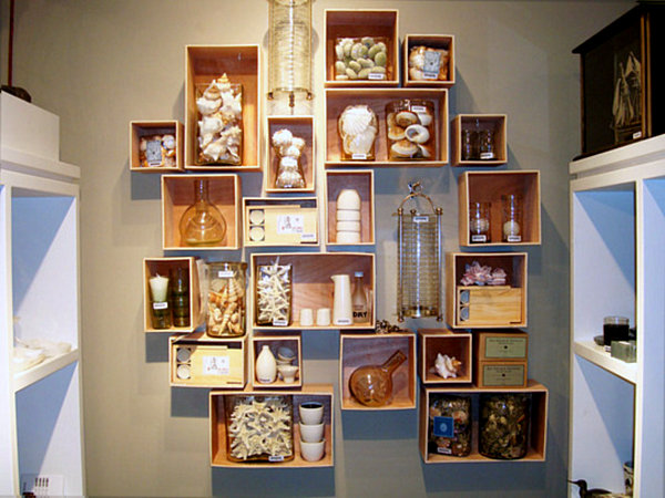
What if your collection became artwork? That’s right–it’s time to hang your treasures on the wall with the help of some creative display techniques. One strategy involves using unfinished wooden boxes as shelves. Ideal for groups of small items, these compact wall compartments can hold jars and vases filled with collectibles such as shelves. [from Apartment Therapy]
seashell collection display1 Creative Tips for Displaying Collections With Style

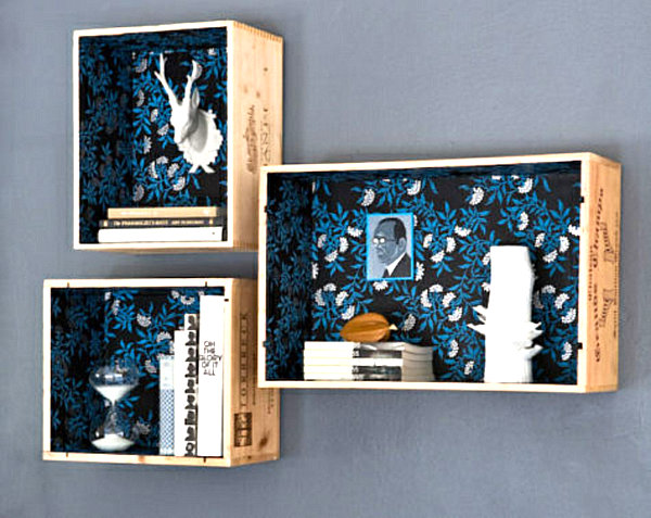
For a fancy take on the wall shelf idea, convert wine crates to display cases with the help of a DIY tutorial from Design Sponge. With the addition of craft paper as an interior lining, these modular containers come to life:

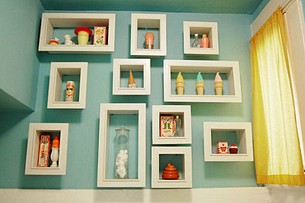
In the image below, shadowboxes are the perfect solution for the display of dessert-themed toys and vintage Avon items. [from Apartment Therapy]


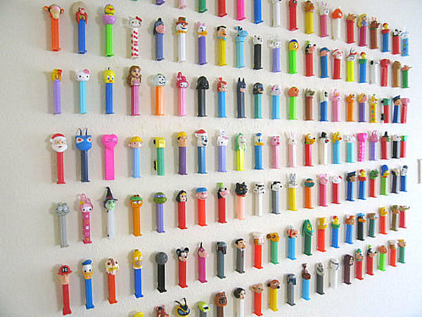
What if you surprised everyone by taking a break from shelving? Try mounting collectibles directly on the wall! With a variety of adhesives to choose from, including poster tape and strips, paint-friendly mounting options are a reality. Plus, applying small items to the wall itself is refreshingly unexpected, as shown by this next collection of colorful Pez dispensers. [from One Good Bumblebee via Apartment Therapy]


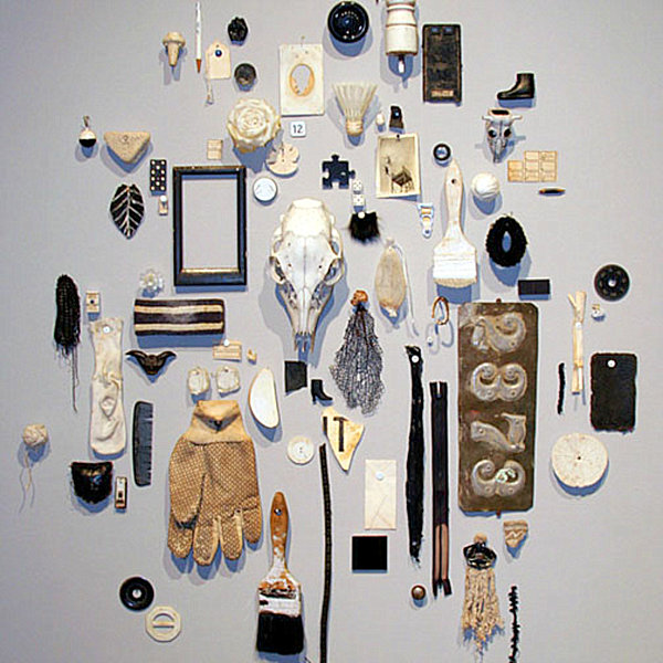
Very whimsical, if you ask me. It's not for everyone. Not to mention, wall-mounted collectibles take on an art installation quality. In fact, the collection below is an actual art installation by Steve Wiman, owner of Uncommon Objects, a quirky vintage collectible shop in Austin, Texas. Note how diverse items are unified by a similar color scheme and worn aesthetic. [from Refueled]

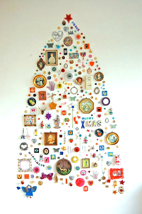
The next wall collection was actually used as a Christmas tree, but it shows how a carefully-crafted layout of small items can create alluring wall art. In fact, a wall grouping is an excellent way to unite seemingly unrelated items, especially if they are arranged to form a larger shape or design. [from All the Luck in the World via Apartment Therapy]

Display Your Collection on a Shelf

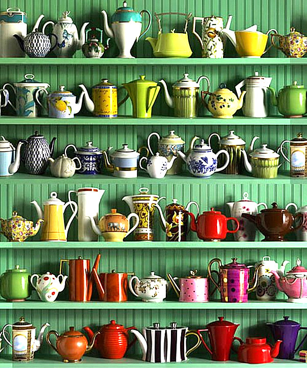
Sometimes a shelf is all you need to give your collection new life. Take the rows of teapots below. A colorful wall and floating shelving are all that’s needed to make the pieces stand out, especially since their sheer number speaks volumes! [from That (Unreliable) Girl]


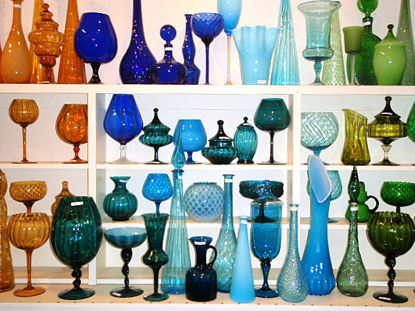
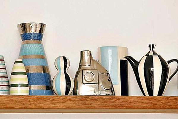
When it comes to shelf arrangements, try grouping your collection by color, as shown by the next display of art glass. While color is a unifying force, there is true diversity of shape, size, texture and transparency. [from Palmetto Estate Liquidators]


While packing shelves with items makes a big statement, strategically leaving some empty space creates impact as well. In the pottery arrangement below, the number of pieces per shelf grows with each level. [from Hus & Hem via Interior Design Sense]


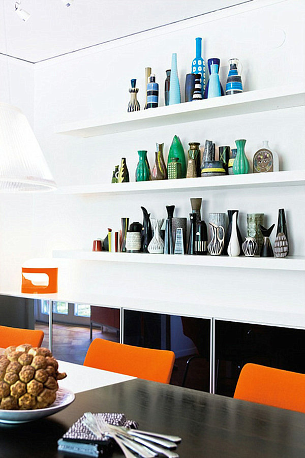
Don’t forget the power of grouping items that share a similar pattern. Jonathan Adler’s striped pottery takes center stage in a shelf display from the weekend home he shares with partner Simon Doonan. [from TucsonCitizen.com]

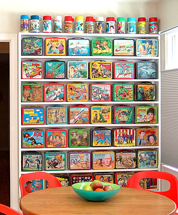
Floor-to-ceiling shelves create a grid effect when lined with geometric collectibles, such as vintage thermoses and lunchboxes. Forget childish–this collection takes on a modern sophistication when placed on simple white shelving in a room with colorful furniture. [from Fanpop!]


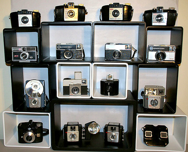
What about stackable shelves? They can be arranged in a variety of configurations, and they become mini-stages for special items such as vintage cameras. [from Flickr user Artemis the Phoenix]


Go for the Unexpected!

When walls and shelves aren’t the answer, perhaps a little dose of the unexpected is in order! In the Parisian home below, globes dangle from the ceiling in a festive display of innovative design. [from The Designer Pad] I'll definitely have to remember this one if I have a recreational room when I get older! This is too neat.


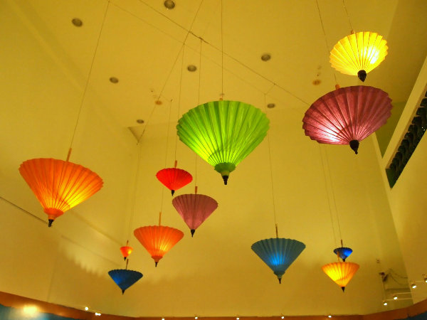
In fact, a ceiling-mounted display can create a whimsical effect, as shown by the umbrella collection that hangs from the ceiling of the Singapore Philatetic Museum. [from Simple Joys in Life]

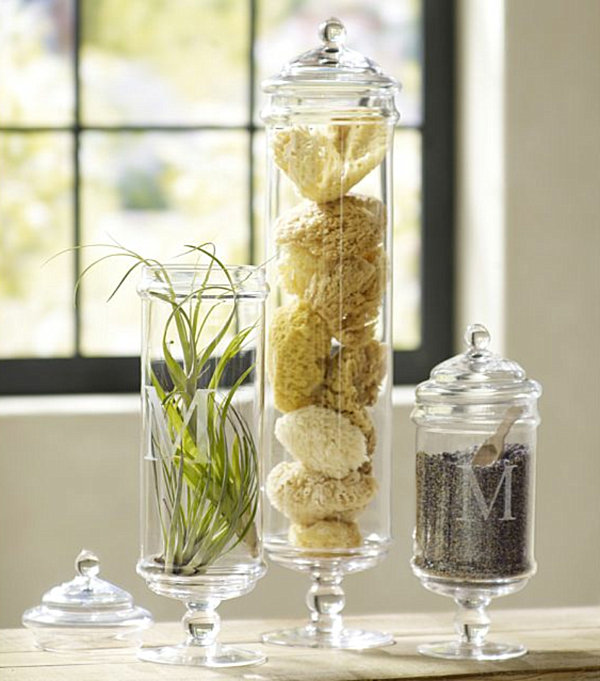
What if you used a collection to display another collection? For example, if you collect containers such as apothecary jars, fill them with collections of other small items, such as sea sponges. [from Pottery Barn]

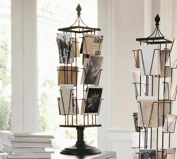
Another unexpected display technique involves purchasing a true conversation piece to hold your collectibles. For example, Tabletop Photo Carousel from Pottery Barn is a showstopper in itself. Fill it with your favorite postcards and photographs, and it’s a win-win!

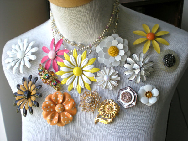
On that note, have you ever considered using a vintage mannequin or dress form to hold a jewelry collection? Now the brooches below can see the light of day in the most stylish of ways! [from House of Onika] My grandmother had a lot of beautiful brooches, and my mother actually made them into a wreath. Another idea.. 
 

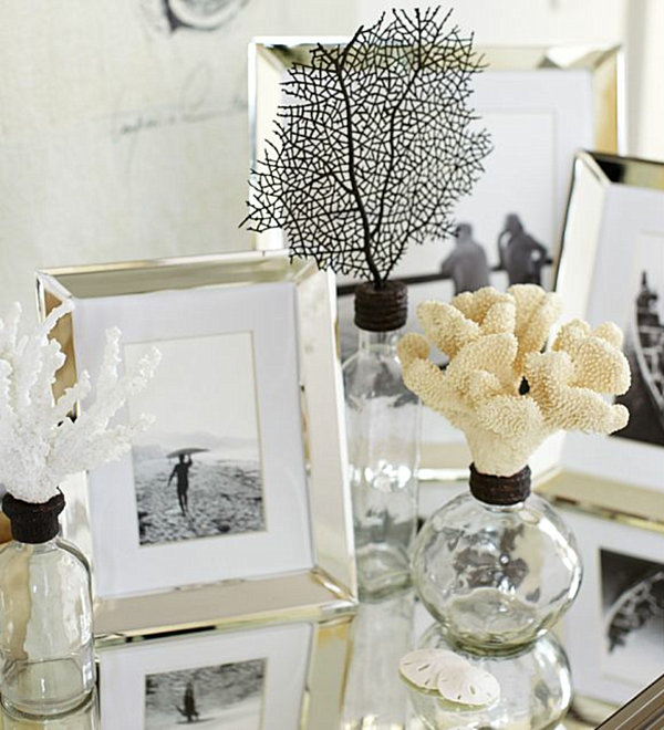
For another clever display strategy, mix your collections! For example, combine seashell-topped glass bottles with framed pictures in an intriguing grouping. Each collection benefits from the addition of a second theme. [from Pottery Barn]


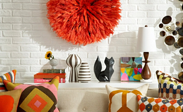
What if the collection were based on a theme or trait rather than object type? For example, in the image below–a photograph of a London Jonathan Adler boutique–pillows, pottery and artwork are unified by their geometric patterning. The result: a room full of happiness! [from Big Design Loves]

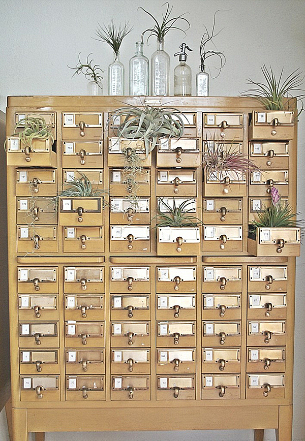
We end with an image from an article on creating a cabinet of curiosities. Try displaying your collection in or on an item that was not originally meant to display objects. As you can see, changing the function of a set of drawers from card catalog to air plant receptacle is a highly original way to make your collection count! [from Poetic Home]

When it comes to displaying a favorite collection, don’t be afraid to draw inspiration from stores. After all, display is the name of their game. Visit your favorite gift shop or boutique and note how merchandise is highlighted and arranged. Can you adapt any of these techniques for your home? Sometimes the art of collecting is matched by the art of display–after viewing the images above, we think you’ll agree!


Have a great weekend!

Friday, December 20, 2013

Color Inspiration

1. CW-460 green umber, 2. 434 herb garden, 3. AF-305 ylang ylang, 4. CW-315 cornwallis red
 
This photo stumbled upon me today and I really feel in love with the color palette. The colors remind me of going home for the holidays, watching Christmas movies with my family, and enjoying time together. It's crazy what certain colors make you feel.
 
I really wanted to see these colors come to life in a room design, so I quickly gathered some pieces from Google image search. I wish decorating was really this simple.
 
 
This would make a great family room or sunroom. It has a very cozy/cottage feel to it, like something you'd see in the mountains. Who knew red and green could actually look good together without being too Christmasy?
 
Tell me what you think!
 
Happy Friday!

Wednesday, December 18, 2013

2014 Color of the Year

I love waiting and watching to find out what the new Color of the Year is going to be. I was so excited when Pantone released 2013's Emerald, because it was my birthstone! I remember getting my mother an emerald cardigan last Christmas in excitement. Emerald is a great color for accessories and can have a bold and dramatic effect on spaces. I've really enjoyed playing with it this past year.

But, as with everything, trends and styles change and with that comes new fab colors to play with. Pantone recently released this year's color and I'm excited to announce that it's Radiant Orchid.


I love this color because of its enchanting and suspenseful nature. Its a color that can sneak into any palette and make a bold statement. Pantone's executive director Leatrice Eiseman said it best, “While the 2013 color of the year, PANTONE 17-5641 Emerald, served as a symbol of growth, renewal and prosperity, Radiant Orchid reaches across the color wheel to intrigue the eye and spark the imagination, an invitation to innovation, Radiant Orchid encourages expanded creativity and originality, which is increasingly valued in today’s society.” Betcha didn't think a color could do that!


“An enchanting harmony of fuchsia, purple and pink undertones, Radiant Orchid inspires confidence and emanates great joy, love and health. It is a captivating purple, one that draws you in with its beguiling charm.”

I totally agree with that last statement. It a very captivating and charming color: both masculine and feminine. Luckily for you, I've compiled a list of some simple, inexpensive pieces in order to add that pop of Radiant Orchid to your space, no matter what style you've got going on.

I hope you add a little Radiant Orchid to your palette next year. I'm not one to immediately find the purple option in things, but it's coming around to me. I'm sure going to give it a try on my next project! Happy Hump Day!

Monday, December 16, 2013

2014 Bucket List

I got the idea from my wonderful friend over on On Miami Time to create a bucket list. 2013 was a year of regrets and realizations. Although none of it was wasted, there are a few things I wish I would have and would not have done.

My biggest regret was getting a dog. I love her dearly, but I sure wish I would've waited until I had a big enough place to corral all of her belongings and had the money to afford everything she's sucked out of me. She's captured my heart now and there's no denying that. Another regret is not networking sooner. Since I finished my internship and gotten this part-time job, I've realized that to make it anywhere in this field you must know people. I should have participated in more CEUs and gotten to know more people. I've also realized that time is only moving faster the older I get. The song "You're Gonna Miss This" by Trace Adkins comes to mind. It's important to be driven for what you want, but it's also important to stop and smell the roses. One day, I'm going to look back on all of this and wish for it back.

This year is going to be the year for me, I can feel it. I'm graduating in March and am hopefully going to land a full-time job so I can quit living this paycheck-to-paycheck life. I've created a Bucket List instead of a Resolution List because it seems more practical and less overwhelming. These items are more so goals or plans I have for the coming year. So here it is: my 2014 Bucket List.


Some of these things will be challenging, but they are doable.
 
What's your plan for 2014?
 
To see my resolution list for 2013, click here. I think I did the majority of these things!

Friday, December 13, 2013

Vintage Vines - The Final Road

Last night, after six long and tiring months of blood, sweat, and tears, I presented my final project as an interior design student. After I was finished, I got a little teary eyed because I realized this was it! I am proud of my accomplishments over the last three and a half years. Each one of my projects was a little different and with each one I challenged myself to do something I'd never done before. With this one, I challenged myself beyond my limits.
 
A little bit about the project: My city was Spokane, Washington and my clients were Mr. and Mrs. Anderson. The idea was to design a wine bar and restaurant below their residence. The entire thing must be handicap accessible and had to incorporate sustainability throughout. On top of all of that, our eight year old child must have a hobby.
 
I researched my city and found a lot of interesting things about it. Spokane is an up and coming metropolitan city just outside of Seattle. Spokane's nickname is the Lilac City from the beautiful lilacs that grow in the springtime. Their economy thrives on mining, timber, and agriculture. One interesting fact is that Spokane was founded through the Northern Pacific Railway and the original train tracks are still in tact. My traditional neighborhood development was Kendall Yards, whose motto is "Urban By Nature."
 
The Northern Pacific Railroad in 1881.

Rendering of the planning of Kendall Yards.

Kendall Yards completed. See the railroad in the background!
So I wanted to pull in some of those pieces into the design of my Live/Work unit. The name of the bar I designed is Vintage Vines. I got the "vintage" part from the history of Spokane. The town is proud of its past and where it has come from. The "vines" part came from Spokane's agricultural heritage and the fact that grapes grow in vines.
 
The first board I have is my greeting and retail area. The greeting area has a mosaic accent wall right when you walk in with the bar's logo on it. The furniture in the greeting area consists of two tulip chairs and a reclaimed timber end table. The dining area has two rows of booth seating with a dropped ceiling for a more intimate dining experience. The table tops are the brown quartz in the middle and the seating is beside it. I brought in some fresh greenery using the city's indigenous lilacs. The resin panel in the bottom right-hand corner is a 9-foot divider wall to break up the space. It's representing the city's natural resource of gold. The lighting throughout is industrial and recycled.
 
 
The next board is my bar area, my favorite part. You can see the flow of the floor pattern by the rendered floorplan at the top right. The two reclaimed timber flooring materials are cut out and represented on the bottom right. Above them, you see the wallcovering in the bar area. It's dark and vine-looking to promote the bar's name. The beige wallcovering is for the public restrooms. The bentwood, bamboo pendants hang scattered throughout. The bar itself is shown in the two renderings on the top left. The front of the bar is a decorative laminate in brushed pewter and the countertops are recycled concrete and glass. The bar stools are in the middle and the wood finish for those are a dark walnut. The flooring for the bar itself is the recycled cork in the bottom left corner. The lounge area is in the far back corner of the bar with more comfy lounge seating. The masculine leather and dark greys help promote a prestigious feel for Mr. Anderson's most important guests. I threw in some bright color pillows and added a unique tree branch cocktail table.
 
 
As you go upstairs to the Anderson Residence, you'll notice the colors are more bright and airy. I did that so that the Andersons would feel relaxed after a long day at the bar. The materials are soft and wood tones are light. The flooring throughout the public spaces are reclaimed timber floors again, except they mimic barnwood. The family and dining rooms are next. The furniture is more rustic and whitewashed and the fabrics are soft to represent Mrs. Anderson's Southern charm. The modular sofa represents Mr. Anderson's love of contemporary design with straight lines. The cocktail table reminded me of train wheels which inspired me to give my eight year old child a hobbiest train table. It's built in to the wall in the family room. The dining room shows more rustic furniture with linen fabric and brass nailheads. The pendant light represents the history of Spokane; everything that goes around, come back around.
 
 
The last board is my kitchen and master suite. The kitchen is where the party is. The cabinets are dark with all stainless steel appliances. The backsplash is a stone and the Venetian gold countertops tie in all those colors nicely. The built in breakfast nook has a round table and two upholstered chairs. The cooktop island has the same pendants you saw downstairs in the greeting area hanging over it. The master suite is the polar opposite of the rest of the home because I wanted it to feel like an escape. I gave the Andersons a tufted headboard and brought in some of the lilac into the accessories. I paired the lilac with a kewi green in the bathroom and brought the mosaic tile from the greeting area up and in the large walk-in shower. The flooring in the bedroom is carpet and in the bathroom is a neutral Travertine tile.


So there you have it! My little child that I've nestled for the last six months. I have to say though, I might be a little biased, but I think it's one the best projects I've done since I started. It's exactly what I envisioned from the beginning of the project till the end. I joke because I can hear the music that would be playing like it's a real place. Can you imagine a soft bongo drum beating in the bar? Okay, maybe it's just me.
 
Anyhow, there's more to this project than just these boards but I wanted to show you my creation. I'm excited though because this is my last "fake" project. I'm on to real projects, with real clients, one that I'll actually get to see when it's finished! That is a reward in itself.
 
So I have one more quarter left where I'll be putting all of my work together into a portfolio. I'll probably cry when I get it all back out again, but it'll be interesting to see how far I've come. My worst through to the best.
 
Let me know what you think. If you don't have a Google account, simply comment/message me on my Facebook page. I like hearing comments so keep them coming.
 
Happy Friday everyone!